Wednesday, December 8, 2010

graphic designer poster

graphic designer project. not finished.
so i finished this poster but i could only find this draft of it.. Paul Rand (born Peretz Rosenbaum, (August 15, 1914 — November 26, 1996) was an American graphic designer, best known for his corporate logo designs, including the logos for IBM, UPS, Espon, Westinghouse, ABS, and NEXT. He was one of the originators of the Swiss deal of graphic design.
 Rand was inducted into the New York Art Hall of Fame in 1972. Rand died of cancer in 1996. He is buried in Beth El Cemetery in Nowalk Connecticut.
this designer likes to focus on negative space and using letters to form things, he messes with letters and negtvie space all the time and makes it look awesome for company logos
you can go to his website by clicking on this 
i chose this designer because i like the way he uses these tools to create such cool logos for business's i also chose him because i love the  logos he made and how he made them
i think you should check out and support his work, he is a great graphic designer and a great man..
again   check out his stuff here

Tuesday, December 7, 2010

Surrealist design

Surrealism project

i liked photoshop better because it has cooler tools i can use to make a picture look real or cleaned up. the one thing illustrator has thats better then photoshop is the flare tool ( i love the flare tool) and like the more freedom you get with the tools. i think some benefits i will have using photoshop is the healing projects to heal and restore photos back, to make it look real.

Wednesday, November 10, 2010

Activist Poster

"Don't let peer pressure crush you"
This is my Activist poster. it tells the reader statistics abut peer pressure and also it sends a strong message " Don't let peer pressure crush you" i like how i made peer pressure like falling walls and all this pressure raining down. it symbolizes that we are getting hit with peer pressure from every angle every where we go.

Monday, October 25, 2010

quote design

Morgan freeman quote design
this is my quote design, what influenced me to design it his way was the quote basically said that all birds weren't meant to be caged and they should be free, so i used this open window to symbolize freedom of the caged bird. i made it my own by adding my creative thought into it, i didn't steal any design ways off of anyone i just designed it the way i wanted it. the process i went through designing this was difficult.i started off struggling finding a good quote i could use, then it was hard to think of a way to symbolize this quote through pictures, but the hardest task was creating, and putting the whole thing together as one idea.

Tuesday, October 12, 2010

emotion designs!!


these are my four emotion designs: excited, Shock, Crazy and organized, Loud and quiet. I think how lines are displayed plays an enormous part in showing emotion in a design. for example big bold letters would be for loud and not quiet. in my first design, excited, i used a lot of squiggly lines to show excitement and energy. in my crazy and organized design i used lines that went everywhere to show crazy and unorganized, and i used straight orderly lines to show how organized it is. these new things i learned could be used in my future designs by, showing more emotion in my designs, or illustrating with lines instead of words to show emotion in my future designs.

Friday, October 1, 2010

logo design, my name

my name logo design 
This logo i  have designed is supposed to look like a person made out of the letters that spell my name and the first letter of my last name. one element of design i used in this artwork is shape, i shaped all these letters to look like a person. the assignment for this design was to use negative space to make a logo for your name. i made it my own by showing excitement and energy in the person. the creative process i went through making this deign was easy but hard at the same time. the planning was hard , because i could  not think of anything to design, but putting the logo together was fairly easy for me.

Friday, September 24, 2010

Graphic design

Graphic design
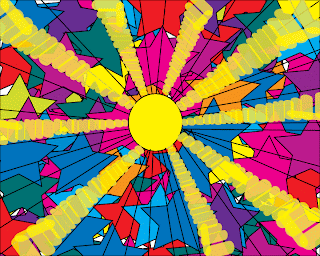
I like this design because it uses a lot of colors and it looks like it is sucking you in. i found this on turboweb, it is  website that makes designs and other stuff, for more of there work click here

Tuesday, September 21, 2010

Cover page for my design book

cover page
this design is for the cover of my design book. i think it looks kind of good. it contains basically anything i wanted it to contain

Monday, September 20, 2010

design book page 5!

Color design
This design is the 5th one in the design book and its all about using colors and other tools i have learned in the past with the other designs

Wednesday, September 15, 2010

Four Design Book page 4

Gradient,line, and pattern design
this is my fourth design in the design book. It has all, gradient, line, and pattern designs.

Tuesday, September 14, 2010

Design book page 3

Pattern Design
This design is about pattern and how to use pattern tools and other tools to help me prepare for page four the last page. the design contains a few different designs and  i made it my own by adding three different patterns together to create the back ground. the process i went through to create this was pretty easy. i just started off by creating black and gray patterns and put them together for the background then i thought of a repetitive circle thing  that has smaller circles in it. i thought if i added a shape it would fill up some space so i started off with just one star outline and made it into a star filled with other star that kind of forms a pattern

Friday, September 10, 2010